
BACK
BACK
BACK
BACK
BACK
Wunderkind Copy Center
Anime Awards Voting
Revamping the Anime Awards voting site for desktop + mobile
Revamping the Anime Awards voting site for desktop + mobile
The r/anime Awards is an annual event organized by a team of volunteers for a community of 3 million subscribers on Reddit. Subscribers can vote for their favorite shows, characters, voice actors, and more across 22 categories.
The r/anime Awards is an annual event organized by a team of volunteers for a community of 3 million subscribers on Reddit. Subscribers can vote for their favorite shows, characters, voice actors, and more across 22 categories.
The r/anime Awards is an annual event organized by a team of volunteers for a community of 3 million subscribers on Reddit. Subscribers can vote for their favorite shows, characters, voice actors, and more across 22 categories.
As the sole UI/UX Designer on this project, I was tasked with redesigning the voting process to address user feedback and enhance overall user experience.
As the sole UI/UX Designer on this project, I was tasked with redesigning the voting process to address user feedback and enhance overall user experience.
As the sole UI/UX Designer on this project, I was tasked with redesigning the voting process to address user feedback and enhance overall user experience.
Company
Independent Project
My Role
UI/UX Designer
Duration
October - November 2023
The Problem:
"Feels Like Google Spreadsheets"
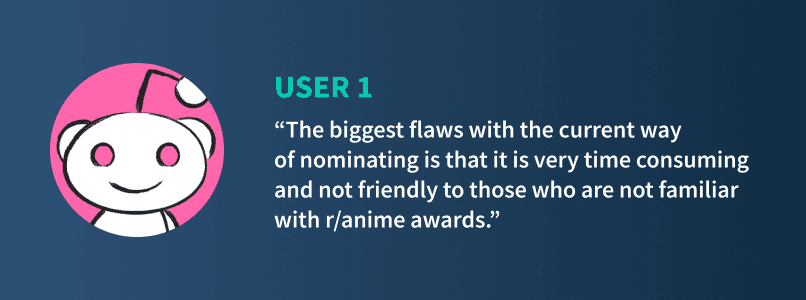
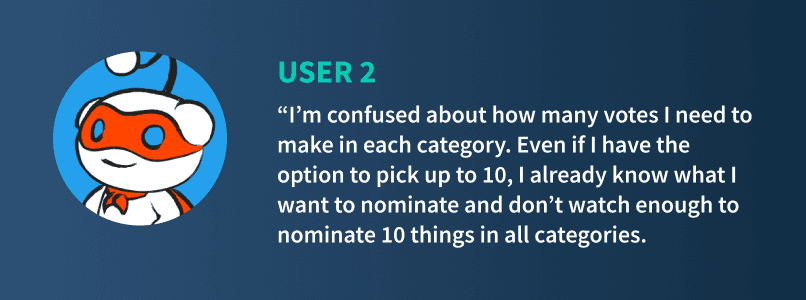
The existing voting process was criticized for being tedious, confusing, and visually unappealing, causing many users to abandon before finishing the voting process. Key issues included:
Ambiguity regarding the number of entries to nominate and the number of categories to vote in.
Difficulty navigating between categories, especially when users wanted to revise their selections.
A lack of mobile optimization, making it challenging for users to vote effectively from their devices.
Design Solution
The primary objectives were to:
Improve Visual Appeal: Revamp the site’s aesthetics with vibrant visuals and a cohesive color scheme to make the voting process more engaging
Mobile Optimization: Implement a mobile-first approach to accommodate the majority of users voting from their phones
Restructure Information Architecture: Organize the information in a way to inform new navigation, guiding users in the voting process
Improve Search Function: Users were frustrated trying to use the sear
We had several necessary criteria we determined through our research:
Consolidation: The tool needs to be able to handle creation, updating, and importing
Automated Updates: Changes can populate across the email/onsite channels in the series if needed
Added Functionality: Implement highly requested features to streamline updates, including tab-switching based on user selection in the Copy Center and smart field mapping
The primary objectives were to:
Improve Visual Appeal: Revamp the site’s aesthetics with vibrant visuals and a cohesive color scheme to make the voting process more engaging
Mobile Optimization: Implement a mobile-first approach to accommodate the majority of users voting from their phones
Restructure Information Architecture: Organize the information in a way to inform new navigation, guiding users in the voting process
Improve Search Function: Users were frustrated trying to use the sear
Results
The redesigned voting site received much praise from participants, especially those on mobile devices. Many also praised the refreshed aesthetics.
The redesigned voting site received much praise from participants, especially those on mobile devices. Many also praised the refreshed aesthetics.
The redesigned voting site received much praise from participants, especially those on mobile devices. Many also praised the refreshed aesthetics.
The Process
Research
Although I was unable to conduct user interviews, I was able to gain insights on user pain points by reading through threads on last year’s awards event. The most common pain points I encountered was that users felt confused by vague requirements and frustrated by a long voting process that wasn’t friendly or intuitive to interact with.
Although I was unable to conduct user interviews, I was able to gain insights on user pain points by reading through threads on last year’s awards event. The most common pain points I encountered was that users felt confused by vague requirements and frustrated by a long voting process that wasn’t friendly or intuitive to interact with.
Although I was unable to conduct user interviews, I was able to gain insights on user pain points by reading through threads on last year’s awards event. The most common pain points I encountered was that users felt confused by vague requirements and frustrated by a long voting process that wasn’t friendly or intuitive to interact with.
The three main problems I noticed amongst users were:
The three main problems I noticed amongst users were:
The three main problems I noticed amongst users were:

Ideation
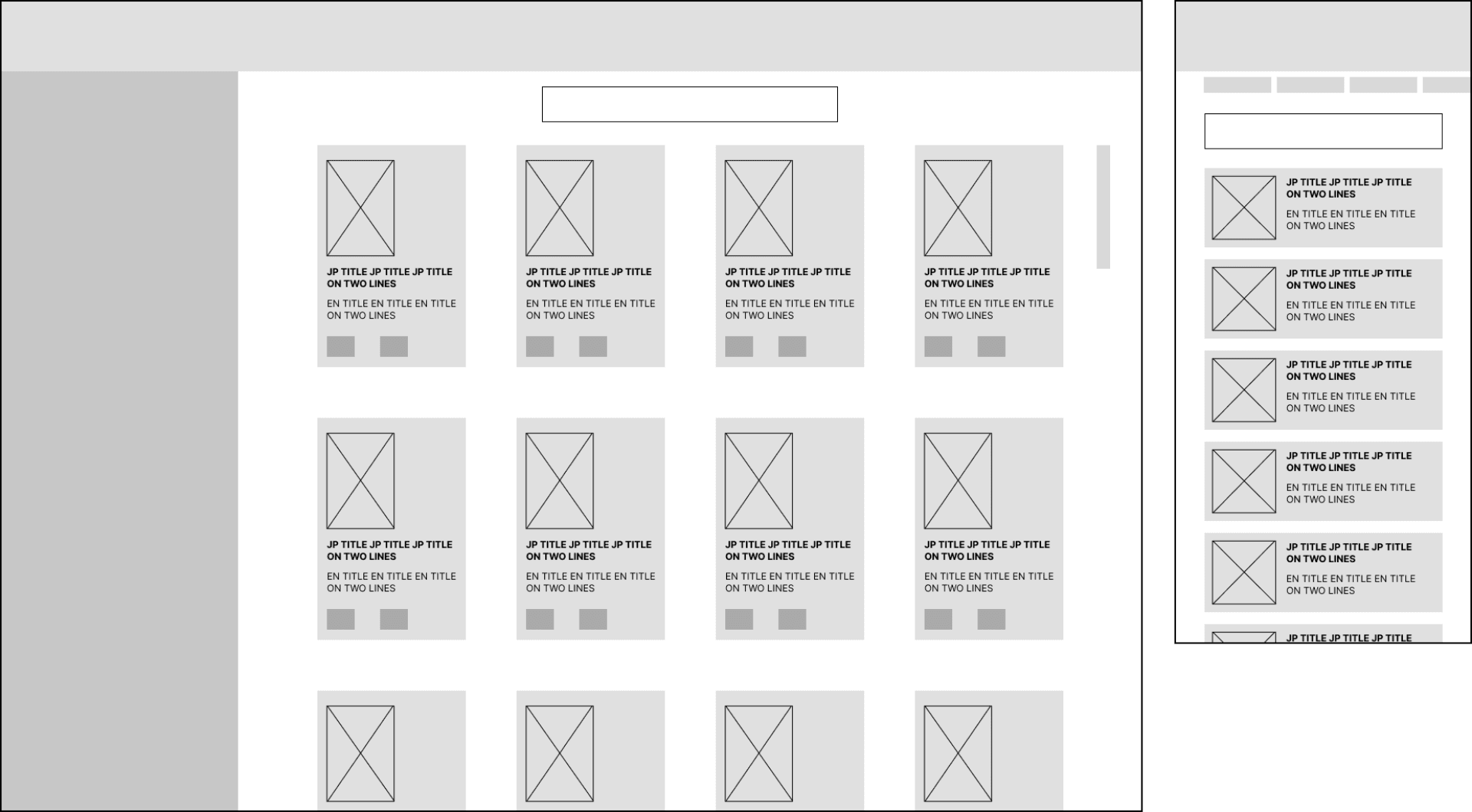
There were several requirements that posed a challenge in solving the UX problem—namely, the number of categories and moderators wanting a way to encourage users to nominate multiple entries in each category, despite users only needing to vote for one to complete that category. The number of categories would be a challenge for mobile screens especially, due to the limited amount of screen real estate. I started with sketches for both desktop and mobile experimenting with layout:
There were several requirements that posed a challenge in solving the UX problem—namely, the number of categories and moderators wanting a way to encourage users to nominate multiple entries in each category, despite users only needing to vote for one to complete that category. The number of categories would be a challenge for mobile screens especially, due to the limited amount of screen real estate. I started with sketches for both desktop and mobile experimenting with layout:
There were several requirements that posed a challenge in solving the UX problem—namely, the number of categories and moderators wanting a way to encourage users to nominate multiple entries in each category, despite users only needing to vote for one to complete that category. The number of categories would be a challenge for mobile screens especially, due to the limited amount of screen real estate. I started with sketches for both desktop and mobile experimenting with layout:
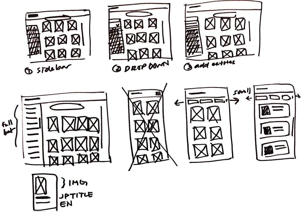
After discussing low-fidelity wireframes with the developer, I moved forward with more Figma wireframe iterations of the chosen concept before creating the high-fidelity prototype that the moderator team tested.
After discussing low-fidelity wireframes with the developer, I moved forward with more Figma wireframe iterations of the chosen concept before creating the high-fidelity prototype that the moderator team tested.
After discussing low-fidelity wireframes with the developer, I moved forward with more Figma wireframe iterations of the chosen concept before creating the high-fidelity prototype that the moderator team tested.
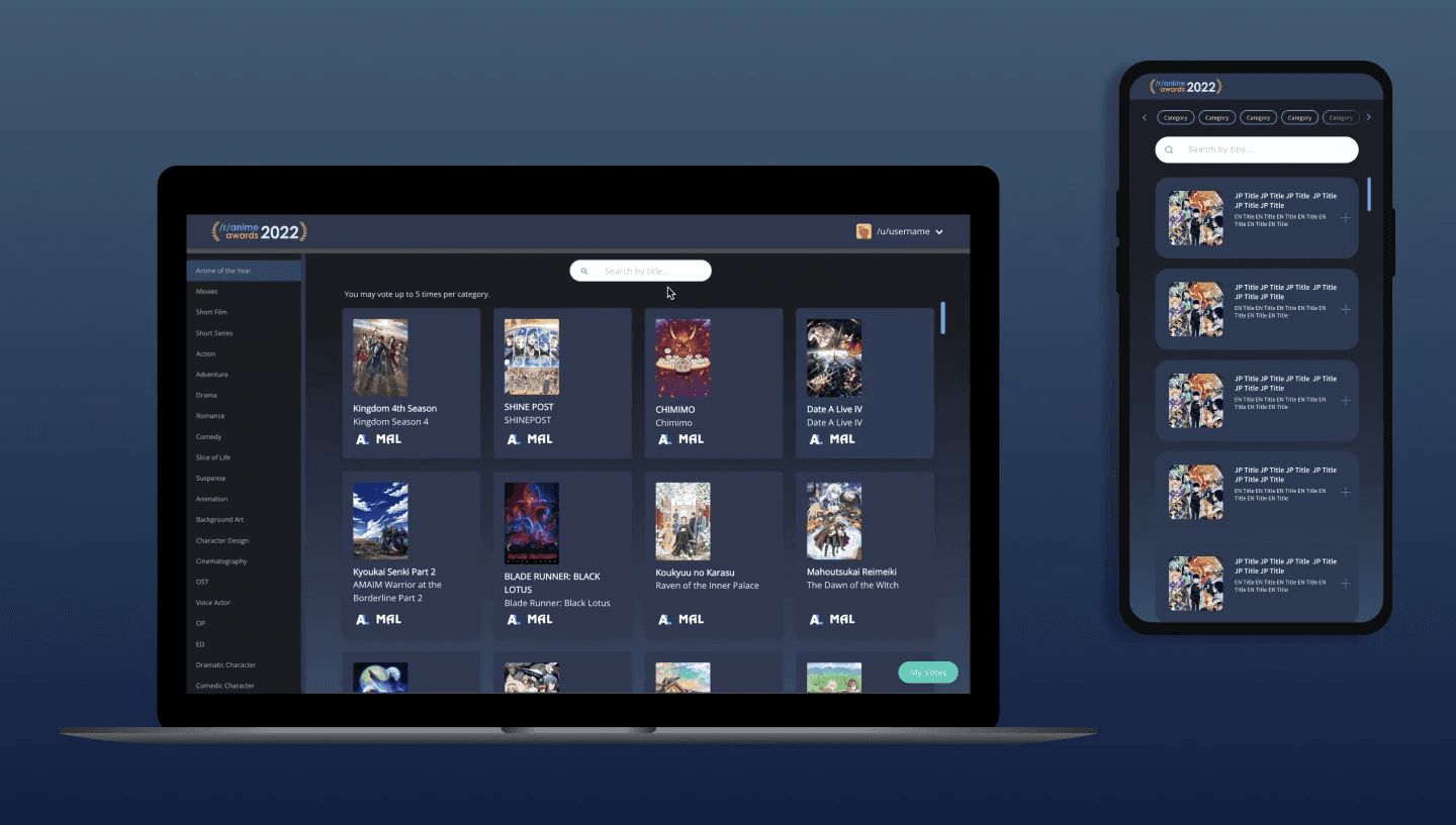
The categories were condensed into a sidebar on the left-hand side with a scroll bar if needed, and different states to indicate inactive, hover, focus, and completed states that would let the user better keep track of where they were in the voting process. Once a user selects an entry in any category, the category name would turn green to indicate completion. All selected entries would jump to the beginning of the list for users to easily see and deselect if needed.
The categories were condensed into a sidebar on the left-hand side with a scroll bar if needed, and different states to indicate inactive, hover, focus, and completed states that would let the user better keep track of where they were in the voting process. Once a user selects an entry in any category, the category name would turn green to indicate completion. All selected entries would jump to the beginning of the list for users to easily see and deselect if needed.
The categories were condensed into a sidebar on the left-hand side with a scroll bar if needed, and different states to indicate inactive, hover, focus, and completed states that would let the user better keep track of where they were in the voting process. Once a user selects an entry in any category, the category name would turn green to indicate completion. All selected entries would jump to the beginning of the list for users to easily see and deselect if needed.
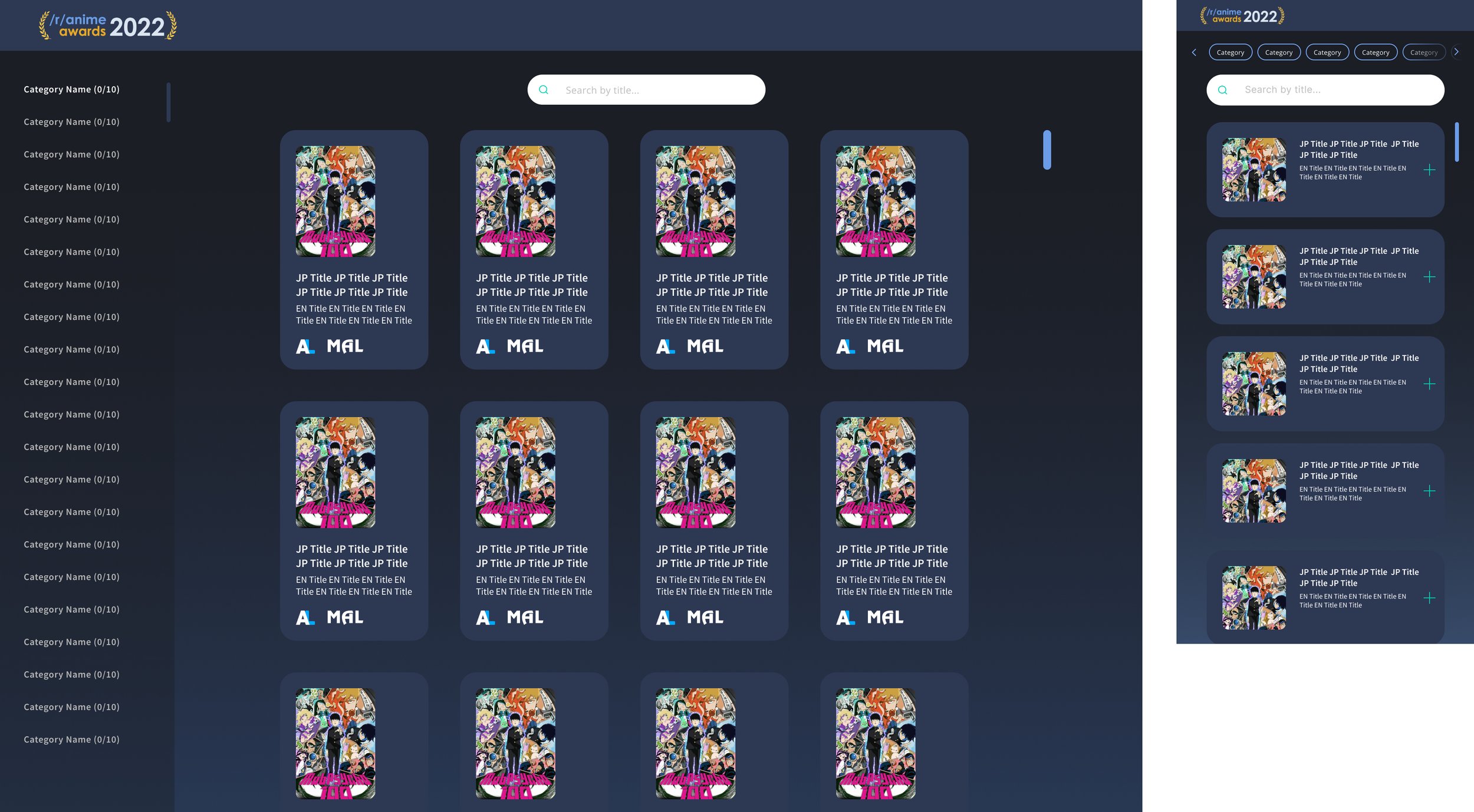
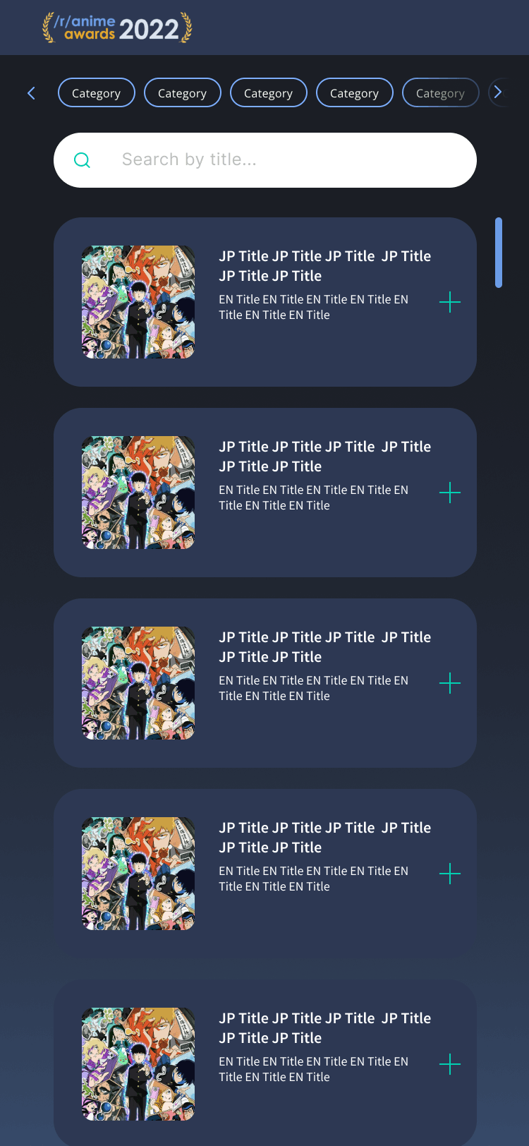
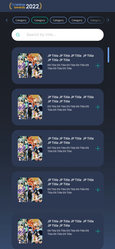
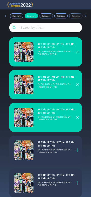
On mobile, I utilized a horizontal scroll for categories at the top to conserve vertical real estate to display entries within a category.
On mobile, I utilized a horizontal scroll for categories at the top to conserve vertical real estate to display entries within a category.
On mobile, I utilized a horizontal scroll for categories at the top to conserve vertical real estate to display entries within a category.
HOME / CASE STUDIES / ABOUT
HOME / CASE STUDIES / ABOUT
Thanks for stopping by!

Have questions, feedback, or just want to chat? Let's connect!
Thanks for stopping by!
Have questions, feedback, or just want to chat? Let's connect!
Thanks for stopping by!
Have questions, feedback, or just want to chat? Let's connect!